2021.01.11
ESSAY_01|平仮名から創出される空間
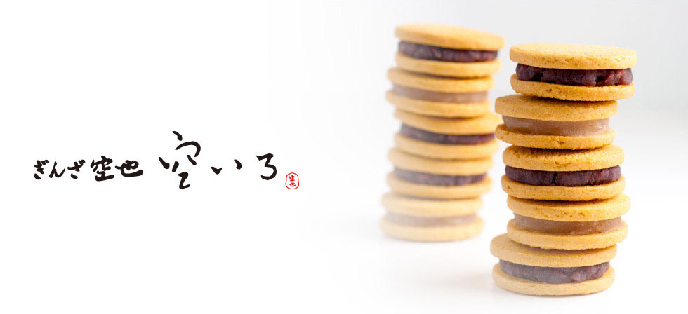
140年の歴史を持つ銀座の老舗和菓子屋「空也」。
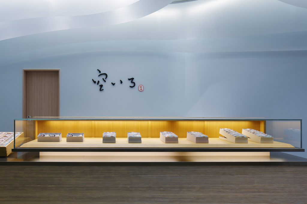
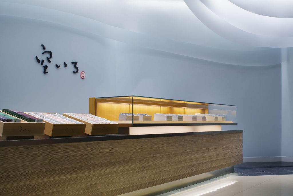
その空也の新ブランドである「空いろ」の川崎店をデザインさせていただきました。
色即是空 空即是色
般若波罗蜜多心经の有名な一節にちなんでつけられた「空いろ」
このブランド名が今回のデザインのきっかけとなりました。
Kuya is a traditional Japanese sweets shop in Ginza with a history of 140 years.
We designed a shop of “Sorairo” which is the new brand of Kuya.
Color Immediate Sky Sky Immediate Color
The brand name “Sorairo”, named after the famous passage of ‘The Heart Of Prajna Paramita Sutra’
, was the main concept for this design.
「空也」是在银座历史悠久的和菓子店,已有140年的历史.
我们设计“ 空色(空いろ)”是「空也」的新品牌.
颜色立即天空 天空立即颜色
以般若波罗蜜多心经的著名段落命名的品牌名称“ 空色”是我们设计的启发点.
「空いろ」具体的な色名ではなく、空を直接色の名前として表現しています。
空は何色かと聞かれたら、多くの人は「水色」か「青」と答えるでしょう。
このように空といっても、人それぞれが思い描く色には、〜水色、水色~青、
青〜とそれなりの違いの幅が存在します。
それを「空」と直接表現することによって、そういった違いの含みを持たせ、色に幅を持たせています。
“Sky color”… the sky is directly expressed as a color name, not a specific color name.
When asked what color the sky is, many would say “light blue” or “blue.”
Even though it is just simple the sky like this, there is a certain range of differences in the colors that each person envisions, such as ~ light blue, light blue ~ blue, and blue.
By directly expressing it as “sky”, we give it the implications of such differences and give it a range of colors.
“空色” 不是特定的颜色名称,而将天空直接表示为颜色名称.
当被问及天空是什么颜色时,许多人会说“浅蓝色”或“蓝色”.
即使成为一个天空,每个人所设想的颜色也存在一定的差异范围, 〜浅蓝色,浅蓝色〜蓝色,蓝色〜.
通过直接将颜色表示为“天空”,这里面会包含一些差异,扩大颜色范围.
さらに色を「いろ」と平仮名で表記しています。
「いろ」を「色」と結びつけるのはとても自然なことですが、それを平仮名で表現することによって「色」という限定された意味以外に、何か含みのような、或いは余白のようなものがそこには存在しているように思えます。
たとえば、中国の漢字の場合は基本的に文字1つ1つが意味を持ち、1字で成立します。逆に英語の場合は文字1つ1つには意味がなく、文字を綴ることによって初めて意味を持ちます。
日本語の場合、現在使われている日本語という言語が形成されてきた経緯からも、中国語や英語より複雑で、これら2つの、もしくはそれ以上の特徴を持ち合わせます。
これはおそらく日本語ならではの特徴であり、中国から伝わってきた漢字と、日本固有の言葉が組み合わさることによって、1つの漢字に2つ以上の読みが存在し、音読み、訓読みと読み替えることができます。また訓読みを日本固有の言葉を表現するための平仮名に変換することによって、 そこにリズムが生まれ、広がりや奥行きといった要素が創り出されます。
文字の変換1つでそこに余白を創りだし、それらを言葉遊びのように組み合わせることによって、また別の次元に広がりをみせて、言葉1つで想像が膨らんでいきます。
Furthermore, the color is written in hiragana as “Iro”.
It is very natural to associate “color” with “color”, but by expressing it in hiragana, it is something like implications or margins other than the limited meaning of “color”. Seems to exist there.
For example, in the case of Chinese characters, each character basically has a meaning, and it is established by one character. On the contrary, in the case of English, each letter has no meaning, and it becomes meaningful only by spelling the letter.
In the case of Japanese, it is more complicated than Chinese and English and has these two or more characteristics, even from the background of the formation of the currently used language, Japanese.
This is probably a characteristic unique to Japanese, and by combining the kanji transmitted from China with the words unique to Japan, there are two or more readings in one kanji, and it is possible to read on-yomi and kun-yomi. .. Also, by converting kun’yomi into hiragana to express Japanese-specific words, rhythm is born there, and elements such as breadth and depth are born.
By creating a margin there with a single letter conversion and combining them like a word game, you can expand to another dimension and expand your imagination with just one word.
此外,将这个空色的色部分以平假名写为“ いろ”.
在日语,将“颜色”与“いろ”相关联是很自然的,但一端通过用平假名表示它,除了“颜色”本身固有的意思之外,感觉它还具有某些含义或类似留白空间存在在里.
例如,汉字的话,基本上每个汉字都有一个意思,由一个字就能成立. 相反,英语的话,每一个字本身是没有意思,通过拼写字才变得有意思.
日语会比中文和英文复杂一些,可能由于当前使用的日语的形成历史原因,具有这两个或多个特性.
这可能是日语特有的特性,通过将从中国传来的汉字与日本固有的言语结合起来,一个汉字中会有两个或多个读法,可以读换音读或訓读. 此外,通过将訓读转换为用于表达日语固有单词的平假名,在其中产出一种节奏,会有宽度和深度等元素.
通过在转换一个单字中产出个留白, 将它们像一种文字游戏组合起来,可以扩展到另一个维度.
通过一个单词就可将想象力扩展.
今回のデザインはまさにこの「空いろ」という文字の組み合わせがもたらす広がりをコンセプトとしたもので、物質の表面の色そのものを具体的に表現するのではなく、空の色には空高く奥行きがあるように、このお店でも奥行きのある現象としての「いろ」を表現しました。
This design is based on the concept of the expanse brought about by the combination of the letters “空いろ”, instead of expressing the color of the material itself, expressing “color” as a deep phenomenonthe as you can see the color of the sky has a high depth in the sky.
这次的设计是 “空いろ” 这种单词组合产出的广阔作为设计概念, 不是用物质本身表面的颜色来具体表示,就像天空的颜色是深深高高一样,在这空间也将“颜色”表达为一种深层的现象.
Copyright © KiKi ARCHi All rights reserved.